Posts Tagged ‘seating’
Sojourn to San Francisco (Pt. 2)
de Young Museum
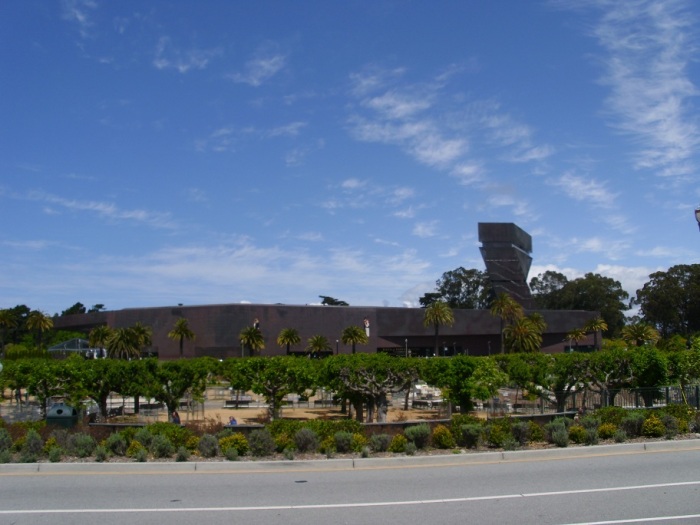
Across from the recently reopened California Academy of Sciences is another new building. The de Young Museum (part of the Fine Arts Museums of San Francisco) looks like a beached and rusting submarine, parked awkwardly in the middle of Golden Gate Park. Vestigial elements of the old building remain; a pair of sexy art deco sphinxes mark where the old museum’s entrance used to be (a few hundred feet from where it is now).
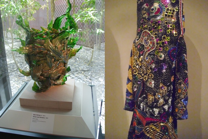
Several of the museum’s collections are displayed on the first floor: Alaskan art, some contemporary decorative arts, Pre-Columbian, and modern and contemporary American painting and sculpture. Alaska art (mostly small crafts pieces) leads to the contemporary decorative arts gallery. This room contains a mixture of tacky glass pieces from the 80s (purple and teal color palette dominates), predictable pieces like Chihuly, and a Nick Cave body suite thrown in. The dec arts room leads off in two directions, one to the randomly linked pre-Columbian galleries, the other way along a window-lined hallway to the modern and contemporary galleries.
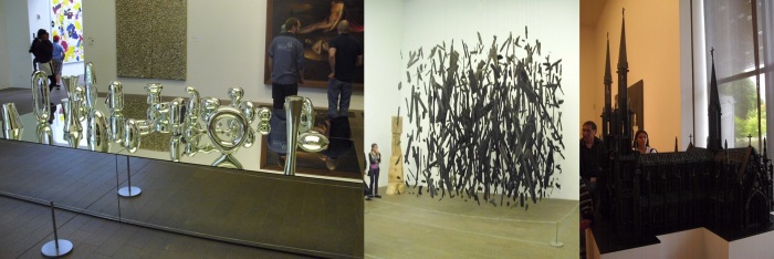
These collections are given the most real estate—allowing the large sculptures and paintings space to breathe without competing with each other. For example: even though Josaih McElheny’s Model for Total Reflective Abstraction (after Buckminster Fuller & Isamu Noguchi) takes up most of the floor in one room, a hanging fixture of burn wood, Cornelia Parker’s Anti-Mass, and Al Farrow’s cathedral reliquary made from ammunition are all given their due space.
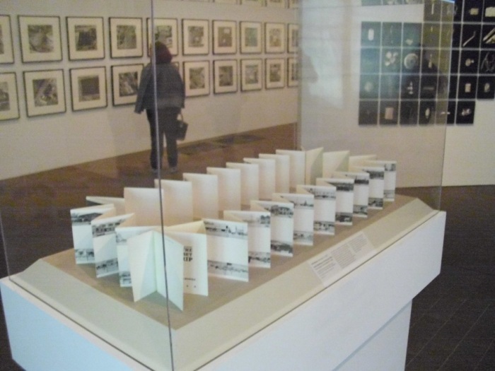
Several rooms of painting later, was a smaller room with a special curatorial title and wallpanel. Photo / Synthesis features works by eight contemporary artists “who have explored various methods of assembling and organizing photographic images into multifaceted constructions.” Predictably Ruscha is included; in a series of parking lots, and of course Every Building on the Sunset Strip. I was surprised with how awkwardly the accordion book was displayed, it was even worse than how it was displayed in LACMA’s New Topographics. The form of book was completely denied in the de Young’s display, which was laid out in a ring standing up on its side. The display of Every Building that I think was the most successful was how it was displayed in a show at the USC Fisher Museum of Art. In a long display case that reached almost from wall to wall, the accordion book was laid out flat and almost to its full length.
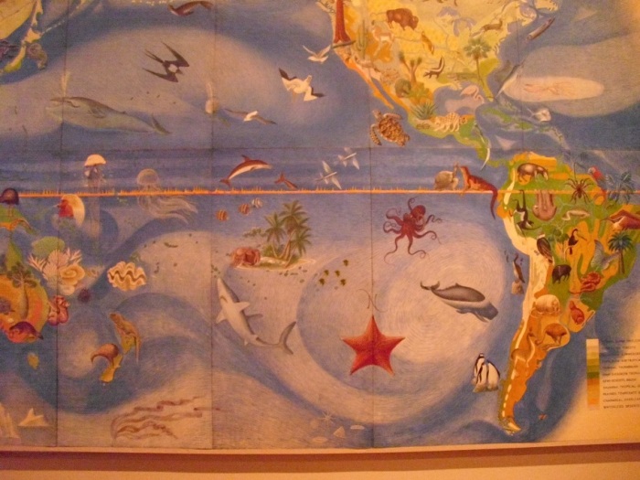
I circled back to explore the Pre-Columbian galleries. Pre-Columbian galleries interest me especially since seeing the Jorge Pardo designed galleries at LACMA. (Look for a post comparing LACMA’s Pre-Columbian galleries to the Natural History Museum’s galleries soon.) Had I come out of the dec art gallery into the Pre-Columbian galleries, the first thing I would have seen would have been the dominating wall mural. This kitchy map of the world displays various flora and fauna, and seems more educational in function than artistic. The de Young sometimes has an odd way of connecting adjacent galleries with seemingly unrelated works. This map is one of those odd ways.
The display of the Pre-Columbian collection is fairly standard, other than being in a glass walled, natural light-flooded room. At the de Young wall cases, and free standing glass vitrines are light naturally, somehow making the objects more relatable and utilitarian, rather than simply being elevated to the level of an art object.
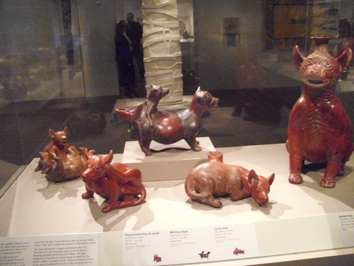
Little explanation is given for many of the objects, especially in the case of the Western Mexican ceramics. These objects are notoriously looted, and became popular with collectors especially in the early half of the 20th century. One of these ceramics even features prominently into an Alfred Hitchcock film. Similar like ceramic objects are gathered into vitrines, one has a cache burnished dogs in various activities, even including copulation.
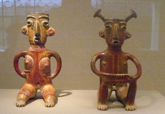
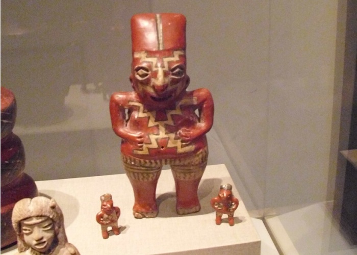
Another thing that struck me about some of the Western Mexican ceramics was the similarity of works, with ones I have seen in Los Angeles. The female and male burial pair with odd geometric appendages is almost identical to ones found in the Natural History Museum. A figured with a white running geometric design is a twin of one in the Natural History Museum, and a triplet to another at LACMA. These “types” are so prevalent in collections, and yet so little is known about them as they are scavenged from burial sites with no archeological information known about them.
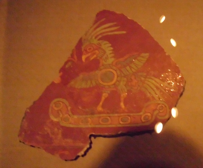
Other works in the de Young’s collection do have a lot of attribution, explanation, and even respectly present this information. One dim room contains a collection of murals from Teotihuacan from the Wagner Collection. The wallpanel is almost apologetic and therefore praiseworthy for its honesty and its explanation about museum collecting practices.
“Owing to the size and importance of the donation and ethical issues regarding cultural patrimony, the museum approached officials in Mexico to discuss a cooperative program of conservation and care and the voluntary return of at least half of the murals to Mexico. After several years of negotiation, an agreement between this museum and Mexico’s National institute of Anthropology was executed, providing for the joint conservation, exhibition and disposition of the collection.”
I am really struck with the honesty of this wall panel, and think that it should be seen as an example of the correct way to handle issues of cultural patrimony, and the transparency of the museum’s wheelings and dealings. Okay, I’m getting a little choked up about the walltext…didactics aside, the murals were in excellent condition, the color looks like it was applied days ago instead of the centuries ago that it actually was.
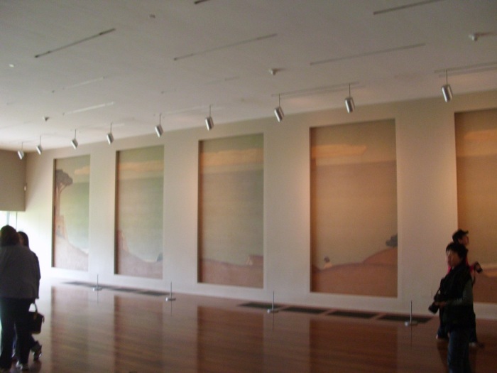
The last thing of note on the ground floor of the museum was a tiny little annex of a room which contained two mural cycles. The two murals, The Land and The Sea, were painted by Gottardo F.P. Piazzoni between 1929 and 1932. More transparency! The labels for these works say they are a “transfer” from the S.F. Arts Commission and the Asian Art Museum. The two, five-panel murals were painted originally for the Old Main Library, and suggested views that might have been seen through the walls of the building. The murals were removed from the Beaux Arts building when it was converted into the Asian Art Museum. The room in which they are now displayed “was designed to reflect the dimensions and arrangement” of the original location. I have a soft spot in my heart for projects like these since I worked a mural cycle, which had been removed from its original home.
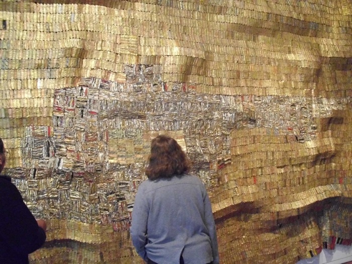
The second floor has galleries reserved for temporary exhibitions, as well as the display of its early American, African, and Oceanic collections. A curatorial trend I’ve noticed with the display of African art is to introduce it with contemporary works. Both in L.A. (at LACMA recently) and at the de Young this took the form of an El Anatsui work. The massive wall hangings, which look like glittering golden weavings by El Anatsui are actually made from recycled metal liquor bottle caps. The works are made in El Anatsui’s native Ghana. The contemporary work which is still craft-based is supposed to related to the more traditional African works in the galleries like masks and ceremonial objects.
Across from the El Anatsui work is the intro walltext for the African galleries. More honesty and transparency:
“The museum’s collection of African art originated in the California Midwinter Exposition of 1894, when exhibits from “the colonies of Africa” and countries around the world were displayed in pavilions in Golden Gate Park. The objects were presented as exotic curiosities in a stereotyped, even racist, manner; few people saw them as works of art.”
It then explains how the collection grew mostly randomly from various sources and that the objects on display are “mostly traditional-based arts,” but that the museum hopes that it will “grow in multitude and dimension in the future.” This declaration for pursuing an increasingly scholarly and serious collection makes the collection more valuable to the public. It also seemed to be a genuine statement of redress .
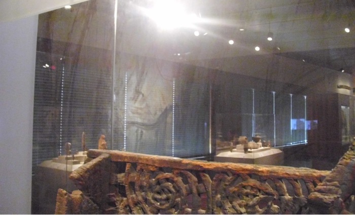
Linked to the African galleries are the Pacific Island galleries (typical museum strategy for putting the “primitive art” next to one another. The de Young never uses the term “primitive” I should add.) The large wooden vitrines are massive and beautiful in their own right except they seem in desperate need of cleaning. Finger and large handprints were strikingly visible on the glass of the cases, and they seemed neglected. This bothered me mostly because the remedy seems so easy, grad some Windex!
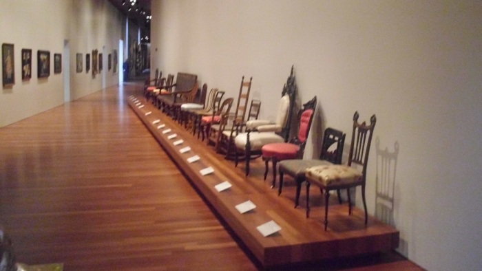
The de Young also has an extensive collection of earlier American art installed on the second floor: painting, sculpture, decorative arts and furniture. One of my favorite installations of objects from the permanent collection was an installation of a slew of various chairs in a skinny corridor. This installation seemed Warholian, and reminded me of Warhol’s curated show Raid the Ice Box at the Rhode Island School of Design. Unlike Warhol’s exhibition, all of the chairs in the de Young display are well conserved, but viewing them like this in one line allows for a visitor to see trends in object-making and compare materials and craftsmanship.
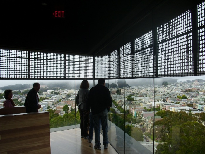
Crowning the museum is an observatory tower whose top floor can be accessed by the public and allows for sweeping views of Golden Gate Park, and on less-foggy days amazing unobstructed views of the city. The de Young also has special exhibition space. The largest of these exhibition spaces is on the lower level of the building. The next post will be a review of Birth of Impressionism, a traveling exhibition of works from the Musee de Orsay.
– H.I.
Art of the Pacific Galleries
Los Angeles County Museum of Art
Towards the end of last year LACMA installed a gallery for its newly acquired collection of oceanic art. This is not your regular exhibition however; LACMA once again solicited the talents of an artist to help out with the exhibition design. The Austrian artist Franz West was brought on to bring a create edge to the installation. West had a solo exhibition at LACMA last year, which was interestingly enough installed in the same galleries that the Art of the Pacific now occupies.
The galleries are on the ground floor of the Ahmanson Building, right as you come in from the BP entry pavilion, you walk under Tony Smith’s Smoke, and make a right. The galleries are sun-lit because of the large open windows that look out onto the recently opened Cantor Sculpture Garden.
The introductory wall text explains that the way this installation has been organized with “geographic groupings that follow population migration patterns, from west to eat, in the general sequence of the settlements of these Pacific islands.” A wide range of material culture is displayed, similar items are grouped, and some are highlighted individually.
The pedestals in the installation are intentionally crude; small forests of two-by-fours make up the bases that support white-washed wooden slabs. If the intention was to be primitive, they are successful.
The walls of the galleries have been washed in maté tea, a process that was explained on LACMA’s Unframed blog. The objects on display were set on platforms and pedestals, which were arranged along with bizarre benches. The benches are unconventional, and verging on the ugly, but are fairly comfortable. My major with them is that they are distracting; the bight green in them detracts from the art on display, and does little to relate to it.
No wall labels are used in the installation, which is frustrating. If you want to know what the object is that you are looking at you have to pick up a huge laminated poster with outlines of the works on display and try to figure it out on your own. There was a different laminated poster for each room, and you look silly carrying the posters around.
The West-created installation follows LACMA’s recent trend of involving artists in installations; Baldessari was brought in to design the 2006 Magritte exhibition, and more recently Jorge Pardo collaborated with the museum on the installation of the much-critiqued Pre-Columbian collection. I have to say that I think the Pardo-designed galleries are more interesting, aesthetically pleasing, and plain prettier that what West designed for the Pacific galleries. However this mode of curation is a way of enlivening the permanent collection, which is a vital task for collecting institutions. LACMA is doing just that, making its visitors rethink the items it has on display.
– H.I.
P.S. Check in soon for developments at LACMA and the reinstallation of their European galleries.
New Topographics: Photos of a Man-Altered Landscape
Los Angeles County Museum of Art
LACMA’s New Topographics, which runs through January 3, is a recreation (but actually a curation of a curation) of a show that was originally presented in the Rochester New York at the International Museum of Photography, George Eastman House, in 1975. Apparently the originally show drew a limited amount of viewers: it was winter, and there was a lot of snow…The Center for Creative Photography in Tucson decided this show was so pivotal that they wanted to recreate it and bring the show to several venues, one of which was LACMA.
The show at LACMA was curated by Edward Robinson, but Britt Salveson probably had a lot to do with the shows incarnation at LACMA as well. Salveson was the director and chief curator at the Center for Creative Photography. Somewhere around the time of this show coming into existence Salveson was sucked up into LACMA and is now the head of both the Wallis Annenberg Department of Photography and the Department of Prints and Drawings. Check out an interview with Salveson here.
LACMA has spent a lot of time and effort on this show, as is evidence to the mini webpages devoted to each of the ten artists in the show found here, here, here, here, here, here, here, here, and here. Further tribute to the importance LACMA now places on photography is the space that New Topographics inhabits. The second floor of the BCAM is half taken up by New Topographics, the other half photographic self portraits (this is the first time the whole second floor of BCAM has been all and only photography.)
The space is actually immense when considering the size of the exhibition. LACMA brags that the two thirds of total work from the original exhibition is in this reincarnation. This is an impressive number; however LACMA has two times as much gallery space compared to the Eastman House. Yikes, this means a lot of white wall. The many colored walls of Your Bright Future have been reformed back into the blinding white cube.
Despite the several issues with labeling, and the issue of curating an already-curated show, I mush say I think the curator was very creative in dealing with the issue of massive space and a smaller amount of content. In some rooms this was done better than in others.
Room 1:
This room was given to Robert Adams. A single line of same sized photos hugged two walls drawing the eye along from left to right. Several vitrines had an awkward presence in the room. These vitrines were there for context apparently, Ruscha’s Every Building on the Sunset Strip, and several other Rucha books were included to show how the design of these books influenced the exhibition catalogue of the original New Topographics. These vitrines seems like a bad way of filling an otherwise sadly empty room, and the things inside the cases were not clearly defined as not being part of the original exhibition.
Room 2:
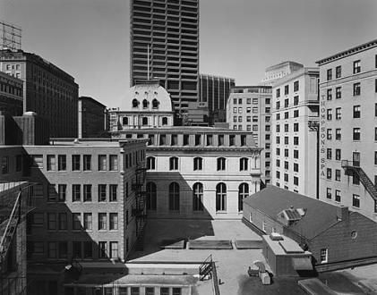
This room was very evenly spaced: two walls each for the two artists, Nixon and Gohlke. These photos weren’t in any particular dialogue with one another. I thought the Gohlke spoke more to the Adams in the previous room or to the Wessel in the following room. Nixon’s photographs of Boston were some of my favorite works in the show, clean and new and seemingly promising.
The Gohlke works brought up an interesting point about the information provided. The work below on the right had a caption which said the photo was taken in ’74, and that it was printed in ’75. Was LACMA bragging about having one of the original photographs? I noticed that the curators were irresponsibly inconsistent with providing this information and distinguishing the dates these photos were printed, and informing the viewers what was an original print.
Room 3:
The Wessel photos in the next room spoke volumes to the Gohlke not just because they both featured barren Los Angeles Landscapes. These amused me for a while trying to figure out their locations, they are all so seemingly familiar, and also very nondescript.

Barren landscape: Baltz, “South Corner, Riccar America Company, 3184 Pullman, Costa Mesa,” From the series New Industrial Parks, 1974
Baltz’s work was also in this room across from Wessel. His series of buildings from industrial park in Irvine were clustered together in a grid in the center of the wall, which for a minute almost distracted me from the inappropriately high white ceilings.
The third photographer featured in this room was Shore. These photos stood out because they were the only in the show that were color photographs, and they were big. I was informed that at the time these photos were originally taken such large-sized color photos would not have been possible to print, so clearly these were printed more recently, a fact that LACMA curators did not point out. Nor did they point out the fact that they had changed the scale of the photos which dramatically impacted my reception of the work. Shame shame.
Room 4:
Deal’s many untitled views of Albuquerque attempted to flood an entire wall in this room, barely managing to fill the space. And then finally a successful attempt at filling the space. The curators attempted the same corner-hugging line of installation used in room one with the photos by Schott. These photos were all from a series where Schott documented Motels along Route 66. The crazy architecture of these buildings flows from image to image around the corner like following an arrow-shaped street sign.
Room 5:
This room was entirely used for the husband and wife team Bernd and Hilla Becher, artist nine and ten. The series of mine architecture and coal manufacturing plants were hung in groupings. One of the works in this room was from the original New Topographics (the tarnished silver frame signified this) was actually a series set into a grouping in the same frame. All the other works in addition to being hung on high, stark white walls, were also framed with in white frames. Oh the little details like frames!
After this last official room of the works from the original New Topographics came two other (what LACMA would say were) contextualizing rooms. In the one room with windows opening up onto Wilshire Boulevard were works by Smithson, Graham and my favorite Turrell. The Turrell piece was a sort of ephemera from his Roden Crater project which makes me go crazy whenever I think about it.
In the final room, which was a kind of screening room was the space created by the Center for Land Use Interpretation. On the far wall was projected a commissioned piece about oil and landscape with a bench set in front of it. Along another wall were two computers for viewing the Center’s website. Plastered above the computers where poster for some of the center’s previous exhibitions which looked like a college student’s dorm room. And obnoxiously there was another living room type space. I mentioned this in the Beuys inquisition were LACMA curators set up an awkward sitting area with cushy chairs and reading materials.
So final conclusions: The photographs in the exhibition spoke for themselves; there was no need for all the extra stuff that was supposed there for context. Sure there was a lot of white walls, but if the curators had just embraced the white expanse full heartedly instead of half-heartedly the installation would have been far superior.
– H.I.
Divine Demons: Wraithful Deities in Buddhist Art
Norton Simon Museum
The “Fierce deities with bared teeth, flame-like tongues, and wicked expressions” of this exhibition are contained to a small concise space, but the show itself is rich and meaningful. The show is unavoidable because of where it is located. At the bottom of the staircase down to the Asian galleries of the Norton Simon, there it is: a nice little alcove of a space, nicely tucked away.

Can’t miss this exhibition
Only approximately 20 works make up the exhibition, most of them are small-scale and necessitate a closer, intimate inspection. The Norton Simon has also done an amazing job with the education of this show. There is a large wall text which nicely explains the items in the exhibition:
“These powerful figures also destroy demons and inner obstacles to enlightenment, such as greed and anger. Their frightening appearance belie the good deeds they perform in protecting individual devotees, monasteries and Buddhist doctrine…In the photo below, the Dalai Lama of Tibet, holding a ritual thunderbolt and bell, performs an initiation ceremony seated in front of a large appliquéd image depicting wrathful gods.”
This wall text was very informative, though some sentences were constructed awkwardly. The mention of the Dalai Lama seemed to be a reference to something from Tibetan culture which perhaps was somewhat recognizable the audience of museum. Along with the introductory wall text, every item in the exhibition had an accompanying wall label with an educational paragraph
Interesting to me was the color chosen in this room. The medium-tone blue paint was too-odd-to-be-a-coincidence similar to the blue-colored walls in LACMA’s Tibetan galleries. To be fare the color was located elsewhere in that level of the museum, but I’m curious as to why this color is so popular in being partnered with Tibetan art.

Blue on blue, nice frames
The museum has provided two small, wooden, yet comfortable benches in the small space. The only medium not present in the small exhibition was stone sculpture, but these works were displayed right outside this space, and were all very large. The show was focused on the close inspection of small intimate objects.

Show and tell of Buddhist treasures
The exhibition was strikingly symmetrical. The C-shaped exhibition was reflective on left and right. Along the right wall were watercolors and small sculptures. One watercolor was framed in a blue mat and ark wood frame, which matched another watercolor across the room which made me think that the works might have been acquired by the same time, or come from the same place.

It's in the details: flames and skulls, very rock & roll
The display case along this wall contained six objects. The objects are made from a wide range of medium, from different times, but all from Tibet. An accompanying diagram to the right of the case provided the labels for these objects as well as more educational information. This small case was like a treasure chest full of precious objects. The workmanship and the details were beautiful in this case, including the carving of a conch shell, and the small inlaid eyes of a skull.

Chakrasamuara: decapitated-head necklaces are so in right now
Another example of small scale details was in another small plexiglass display case. The small bronze sculpture of Chakrasamuara & Vajravarchi (China, lat 18th c.) invited close inspection. The wall text described in detail the gruesome nature of the details: “Each of Chakrasamuara’s four faces has a fierce expression, a fierce eye and a skull tiara. In addition he wears garlands of skulls and severed heads and in his 12 arms holds various attributes: a lasso, and arrows, as well as a thunderbolt and bell.” This description encouraged further investigation of the piece, were those really garlands of heads draped around the figures neck?—Why yes there were, isn’t that precious…

Mandala at the center of the universe / exhibition
This work led to the central (in terms of location) work of the exhibition. The Mandala of Chakrasamuara (Nepal, Kathmandu, 1648) is a large painting featuring the same demonic character as the sculpture directly to the right. Again, a beautiful description accompanies: “surrounding the palace are eight graveyards, separated by stylized waves representing rivers. These charnel grounds…” All of the wording of these texts is very vivid, and helps to explain not only what we are seeing, but also utilizing colorful language which achieves a grim effect integral to this installation examining violence and demons.

From the prop shop?—No, from the Norton Simon
Speaking of violence, the case to the left of the Mandala painting holds some sensational objects, which honestly look like props from a Hollywood movie. The case with ritual weapons holds a Ritual Staff or Club (Tibet 20th c.) and a Ritual Axe (Tibet 20th c.). These objects finalize and literalize the exhibition’s theme of violence.

Orange is the new white box
Among the hall of blue were accent colors. Three items were distinguished by their special mounting in the exhibition. A wooden ritual sword from Tibet, a bronze sculpture of Hayagriva, and a mask of Bhairara were displayed differently from the rest of the works in the room. All of them were displayed in specially made shadow boxes. The frames clearly had been made specially for this exhibition because they were made to look like they were attached to the walls permanently, and painted the same blue color. However, the accent was the orange color used on the interiors of these frames. But why the bright orange color? To admit the first thing I thought of when I saw the color in this context was that it was the color of Buddhist monastic robes (which could be seen in the images of the Dalai Lama in the exhibition). The orange accents did a lot to subtly highlight these works.
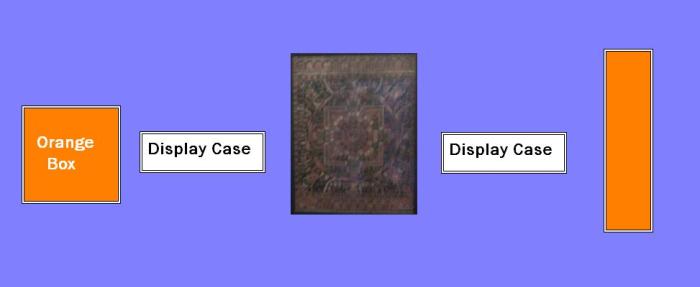
Diagram of back wall, thanks Microsoft paint
These objects fit nicely into the symmetry of the exhibition. All in all the small show was informative and beautiful, showing that even topics of violence can be beautiful.
– H.I.
